The challenge
An outdated website that the Shire's older population had difficulty using.
The solution
A new website with a more accessible navigation, informed by user research.
The results
A modern and accessible online experience that has driven site traffic and engagement.
About Shire of Harvey
The Shire of Harvey is recognised as one of the fastest-growing shires in WA.
They aim to keep in touch with the local community and respond to issues proactively as they arise, as well as plan long-term strategy.
The challenge
The previous Shire of Harvey website was outdated and made it difficult for users to find the information and documentation they needed. Our aim was to create a website design that encourages the Shire of Harvey’s large population of older users to use the website as much as possible. To do this we had to make sure the site was simple to navigate, able to be easily maintained by the shire staff and had accessibility requirements of level WCAG 2.1 AA.
The solution
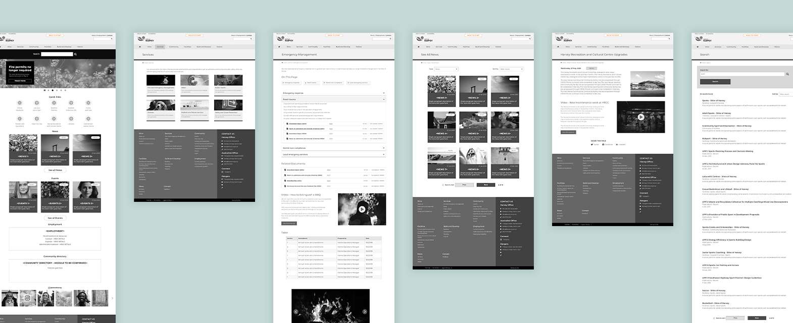
For the Shire of Harvey website, the initial planning stages of the project were crucial to ensure we solved the challenges of all stakeholders. Prior to starting the design, we conducted extensive User Research to create an informed information architecture.
User research
To redesign the website to align with the Shire of Harvey’s goals, we conducted lots of user-focused IA research including stakeholder interviews. We also used data from the previous website to find records of what the local community had contacted the shire about so we could gain a comprehensive understanding of the needs of the local community.
Information architecture (IA)
Once the user research had been completed, we were able to conduct a thorough, complex and detailed IA planning process to allow Shire of Harvey website users to easily access the content that is the most relevant to them.
User interface design
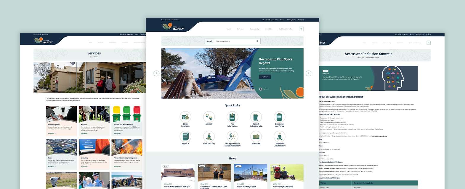
As accessibility was a crucial piece of this project, we analysed the brand’s colours and fonts to make sure they met the AA requirements prior to the design stage. We also created custom interactive icons and graphics to support the website, build the brand and enhance their modern look.
The results
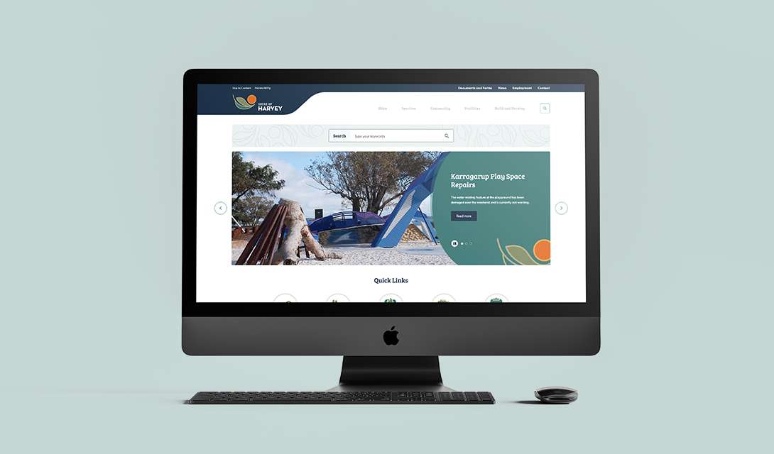
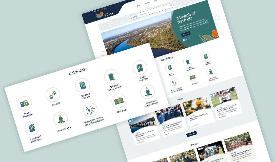
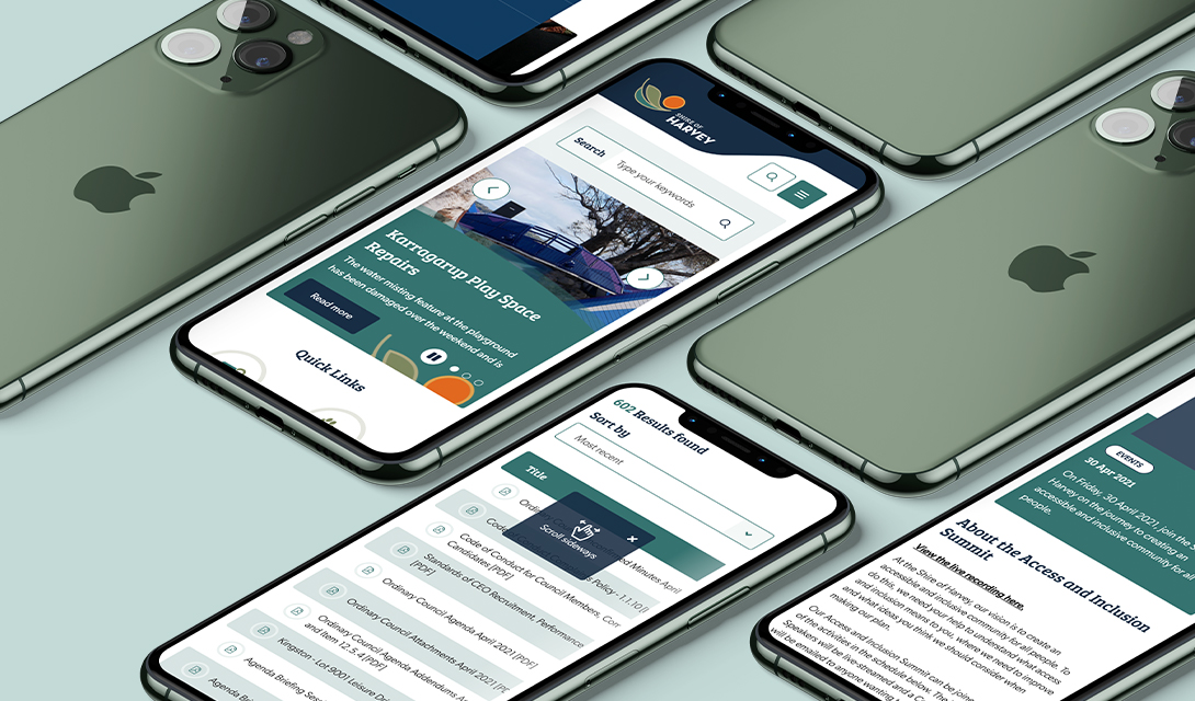
We created a Kentico website that has a great user experience for customers across different groups. It is responsive to all devices and has a clean modern design that is easy and intuitive to use. The site is also simple to navigate due to the user-focused site architecture and intuitive search. The quick links helped users to find important information efficiently, such as council meeting agendas and minutes.
Although we know it looks great and functions well, we like to let the data speak for itself. In a year-on-year comparison, post-launch we achieved:
- 12.9% increase in new users on the website
- 36.64% increase in pageviews
- 18.515% increase in average session duration
- 9.77% decrease in bounce rate.

